Introduction
Boba, pearls, tapioca, bubble tea. If you’re Asian, a boba lover or Singaporean like I am, I’m sure you’re most likely familiar with some - if not all of these terms. Bubble tea has had its eminence in lots of Asian cultures, from its humble early beginnings in Taiwan to now taking up half of my neighborhood shopping mall directories, one can’t deny the notability of bubble tea as a part of our “culture”, if not, a homely cozy drink to temper ourselves from the desolate afternoon heat of Singapore.
I personally grew up drinking bubble tea from 2 different bubble tea stores – namely SweetTalk and KOI. Nevertheless, like the grown adult that I am, I too have come to surmount the childhood crush of my beloved SweetTalk and moved on to my newest bubble tea relationship with KOI, and have been a loyal KOI member and customer since 2022. Even so, like a toxic partner, KOI has always had some ugly parts – namely its ordering experience.
From its conception, like most hawker stalls, KOI has always adopted a standard counter order system. At some point, KOI chose to adopt a self-ordering experience, probably for efficiency by ensuring baristas don’t have to take up orders, at the same time optimizing their profit to employee ratio. In spite of that, my friends and I have generally had certain thoughts about their self ordering system, stemming from unclear user ordering experiences such as their decrepit membership system to their unsightly user interfaces. Ultimately, I’ve always had the thought that it works, but is it good? Not really. Why though, we would have to find out.
Researching
Despite having these thoughts, our team had to nevertheless confirm the validity and critique the KOI self ordering experience. This involved uncovering the main pain points that customers would face in the middle of the KOI ordering experience. We decided to do so through adopting multiple research methods. namely:
- A User Survey conducted with a sample size of 85 previous KOI customers, conducted on Google Forms
- A User interview conducted with a experienced KOI customer through Zoom
The survey was conducted to gather broad quantitative data, along with comments that ascertain certain key experiences and points about why they had good or bad experiences, while the interview was conducted to find out deeper details as to what a seasoned KOI customer experiences when one orders at KOI.
In general, what we found out about the KOI self ordering experience was that in general, most people didn’t know of the multiple different methods that the KOI drink could be ordered.
For example, KOI currently allows for mainly 3 ordering methods – their self-ordering kiosk at their KOI outlets, which is their and recommended method of ordering, KOI mobile app order and pickup, as well as ordering directly from the KOI counter, for which they use at outlets were self-ordering kiosks don’t exist (more rural KOI outlets).
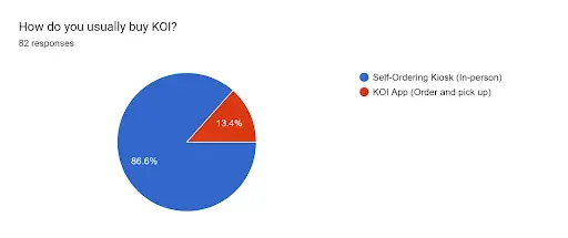
Around 9 in 10 patrons ordered using the Self-Ordering Kiosk at KOI, the other 1 in 10 used the KOI app.
Nevertheless, we chose to press on what way the self-ordering experience might be improved at KOI, and found that most people used the self-ordering kiosks (as expected!) and also found the most problems with the kiosk as compared to other forms of self order.
Therefore, the natural option at that point was to do a deep dive into how to improve the KOI kiosk experience.
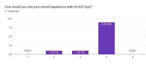
9 in 11 respondents had a relatively good experience with the KOI mobile app!
1 in 4 respondents had a less than moderate (1-3 rating) experience using the self-ordering kiosk
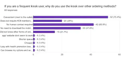
1 in 5 respondents did not know that you could order without the KOI kiosk
Therefore, digging deeper into comments about what problems were experienced by users who used the self-ordering kiosk, we managed to find comments shown below:
“I need to look through multiple categories to find the drink I want”
“i think i remembered one time i pressed “back” from the checkout page bc i wanted to order more and it cleared everything in my cart”
“Sometimes i click on the wrong sugar / ice option, when i first started using the kiosk i couldn't find the "no topping" option”
“The machine lags a lot at times.”
The comments mentioned specific problems with the user experience in the kiosk, especially with regards to the confusion involved in navigating the kiosk to find a specific drink, or to get to a certain page, and being unable to find certain components of the ordering experience.
In conclusion, the insights derived from the survey went into detail into how the layout and the readability of the kiosk was only manageable at best, while they believed that the aesthetics, intuitiveness and navigation all needed improvement, with intuitiveness being the most sought-after improvement. Additionally, feedback from our interview confirmed the above claims, and thus we aimed to find methods and ideas to improve the aesthetics, intuitiveness and navigation of the KOI kiosk experience.
Brainstorming
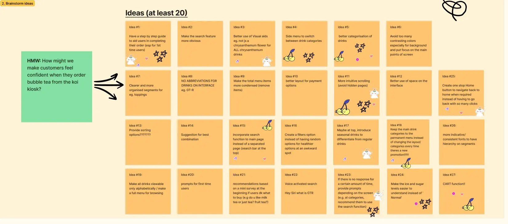
After confirming the claims by surveying and finding out the opinions of the KOI general audience, we had to go back to the drawing board to come up with plans to improve the KOI self ordering experience. The main goal here was to come up with a broad range of ideas that could address the pain points experienced by users from different angles
The natural progression we expected was to focus more on the self-ordering kiosk, since we felt that having the most users recognize it as the only option to order from KOI, we felt that this would have the most impact on improving the self-order experience.
How Might We's
First, we adopted the method of splitting the insights we derived from the research that we conducted, followed by coming up with HMWs (How might we’s), as well as finally deriving success metrics to decide if the idea is successful or not. We decided to adopt a group oriented method of brainstorming, and made use of post it notes in quick consecutive brainstorming sessions.
After coming up with post it notes for ideas on chosen insights, we then honed in on ideas that were decided via a collective vote, where each person in the group chose their top 3 ideas that we would eventually solve from, focusing on deciding on ideas to work on in a very democratic manner.
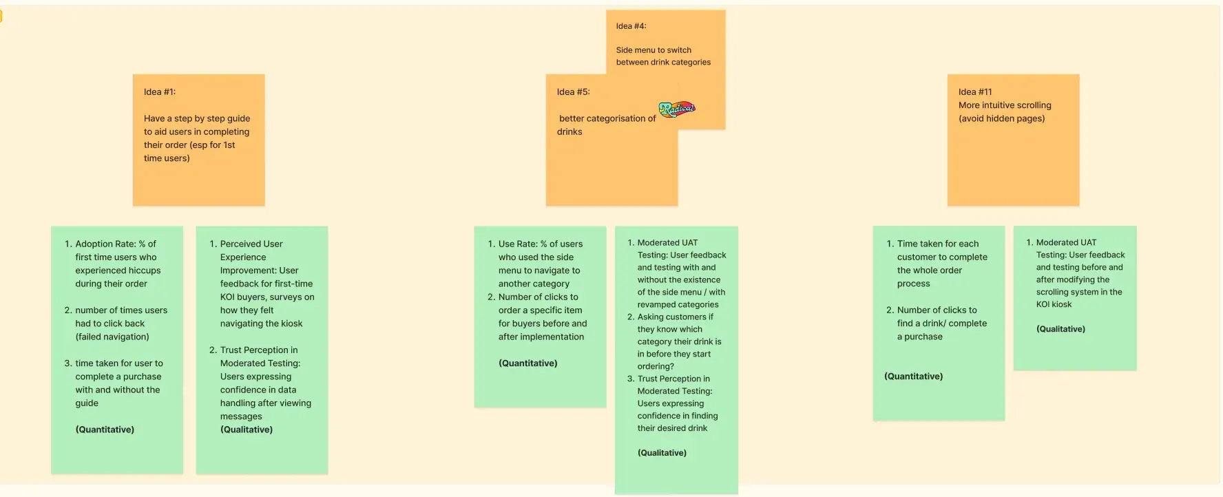
Success Metrics
Ultimately, we segregated these ideas into the top few, and chose to focus on them in our solutioning with Lo-Fi (Low Fidelity) prototypes that will be elaborated in the next section.
Solutioning
Eventually, we proceeded with a prototyping system for which we iterated initial Lo-Fi (Low Fidelity) prototypes based on the ideas that we voted for. These initial prototypes came in the form of small scale drawings that could take up to a few hours to draw and create, to give us a sense of what the ideas would look like implemented, with the plans of combining all of these ideas to create a more intuitive and aesthetic design. Some of the designs that we came up with can be seen below:
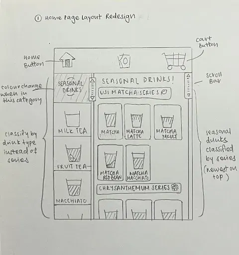
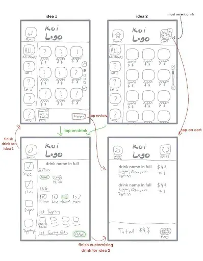
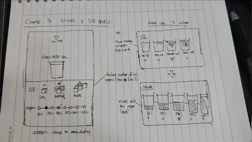
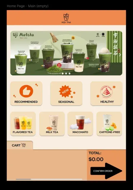
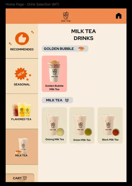
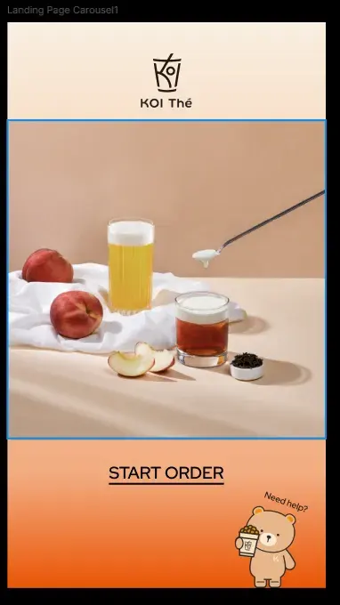
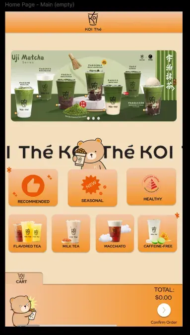
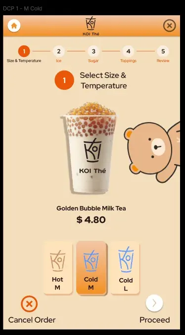
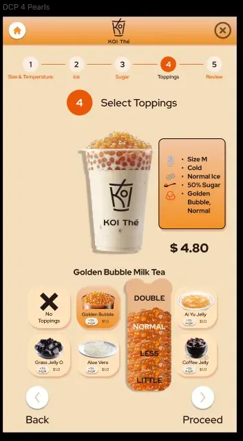
We went through many different iterations of Lo-Fi prototypes, and after converging and combining these Lo-Fi prototypes into one singular prototype, this culminated in our first version of our Figma Med-Fi (Medium Fidelity prototype). This prototype is viewable here, and we also have some screenshots of the screens below:
Testing
Naturally, after coming up with our first solution, intuition goes to test for feedback and iterate on our following design. We went through multiple rounds of testing and feedback. We first used A/B Testing on 10 users, focusing on 5 success metrics, namely:
- System Usability Scale (SUS)
- Time on Task
- Number of Errors
- Success Count
- Retrospective Think Aloud (RTA)
System Usability Scale (SUS) is a standardised questionnaire with 10 questions to measure the perceived usability of a system by providing a score of 0 to 100. A higher score usually means better usability. The average SUS score is 68 and we chose it to decide if a system is manageable or requires refinement.
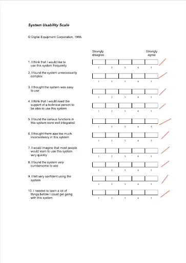
System Usability Scale Template
Time on task refers to the time taken for the user to finish each task. We based these on video recordings of each user task for our prototype on Figma.
Number of errors refers to the number of wrong clicks or deviation from the most optimal path to complete a task. We created an error page and linked it to buttons that would deviate the user out of the most optimal path.
Success count refers to the number of tasks that were successfully completed.
Retrospective Think Aloud (RTA) refers to a usability testing method for which participants verbalise their thoughts after completing a task, while watching a recording of their performance, allowing us to find out common themes about feedback while understanding users’ thought processes while navigating the prototype.
Some of our test results are shown below:
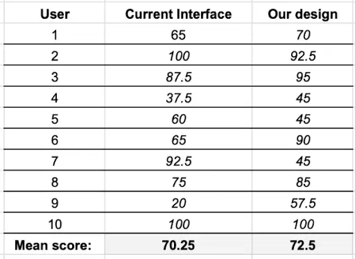
SUS Results
For instance, our SUS results show that the current KOI kiosk interface had an average of 70.25, while our first prototype resulted in an average of 72.5, for which both were above our set benchmark of 68. This indicated that our design improved usability, but the differences weren’t too big.
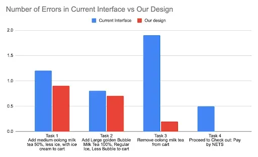
Number of Errors in Current Interface vs Our Design
For the number of errors in our current interface, our first prototype as compared to the current KOI kiosk interface were compared, and we found that the number of errors dipped significantly, indicating an increase in usability of our interface.
Finally, we mainly looked at our RTA feedback. Testers liked 4 main aspects of our design:
- Ease of Navigation and Intuitiveness of our design
- The Cart Summary in the Main Page
- Our bright colour theme and use of the KOI mascot
- Using real pictures and animations for better visual representation
However, some observable elements that they didn’t like were observed as follows:
- Design Inconsistencies
- Too many components in single pages
for which to fix these problems, we had three main goals: Improve Clarity of our screens, Simplify Screens by reducing components and creating some form of Design Consistency
To do so, we decided to utilize a Design System, with 3 main keywords to define our design system. We focused on a simple yet appealing design, with visual indicaters to subtly highlight touchpoints during the ordering process for clarity.
Example of elements in our Design System
After adopting this design system, and going through rounds of discussion and collaboration, we finally came up with our second iteration and final prototype. This prototype utilized elements of our design system such as defined typecales, having numbers in a larger font size of 48 with heavier font weights, headers to indicate main functions of pages, selectable components having slight protruding effects, etc.
This prototype can be found in the link here.
The prototype also has some of the screens as follows:
Ultimately, given the scope and time of the project, we could’ve went through more iterations of testing to get more feedback about the current state of our prototype, but these are the main getaways and finalized iterations of Reimagining the KOI Self Ordering Experience for the group Garry and Friends. This module was a culmination of NTU’s DV2008 module.
Thank you for reading!